Hi, I'm Brian.

I design digital products that are delightfully easy to learn and simple to use.

Skills & Experience

How I can help you

Design

Design Systems, UX Research, Wireframing, Prototyping, Hi-fidelity UI Design, Usability Testing

Communication

UX Writing, Technical Documentation, Copy Writing, Presentation Design and Development, Content Editing

Web Development

HTML, CSS, Javascript

Software/Systems

Figma, Figjam, Zeplin, Zeroheight, Adobe Creative Suite

Portfolio

Some examples of my work

portfolio img 3

Cloud Software

As head of design at a growing software company, I had the opportunity to guide the creation of the design system and ux strategy for their cloud automation platform. This project involved reimagining the customer experience and tailoring it to an array of different personas whose needs could vary widely depending on their role-based permissions.

Details
portfolio img 2

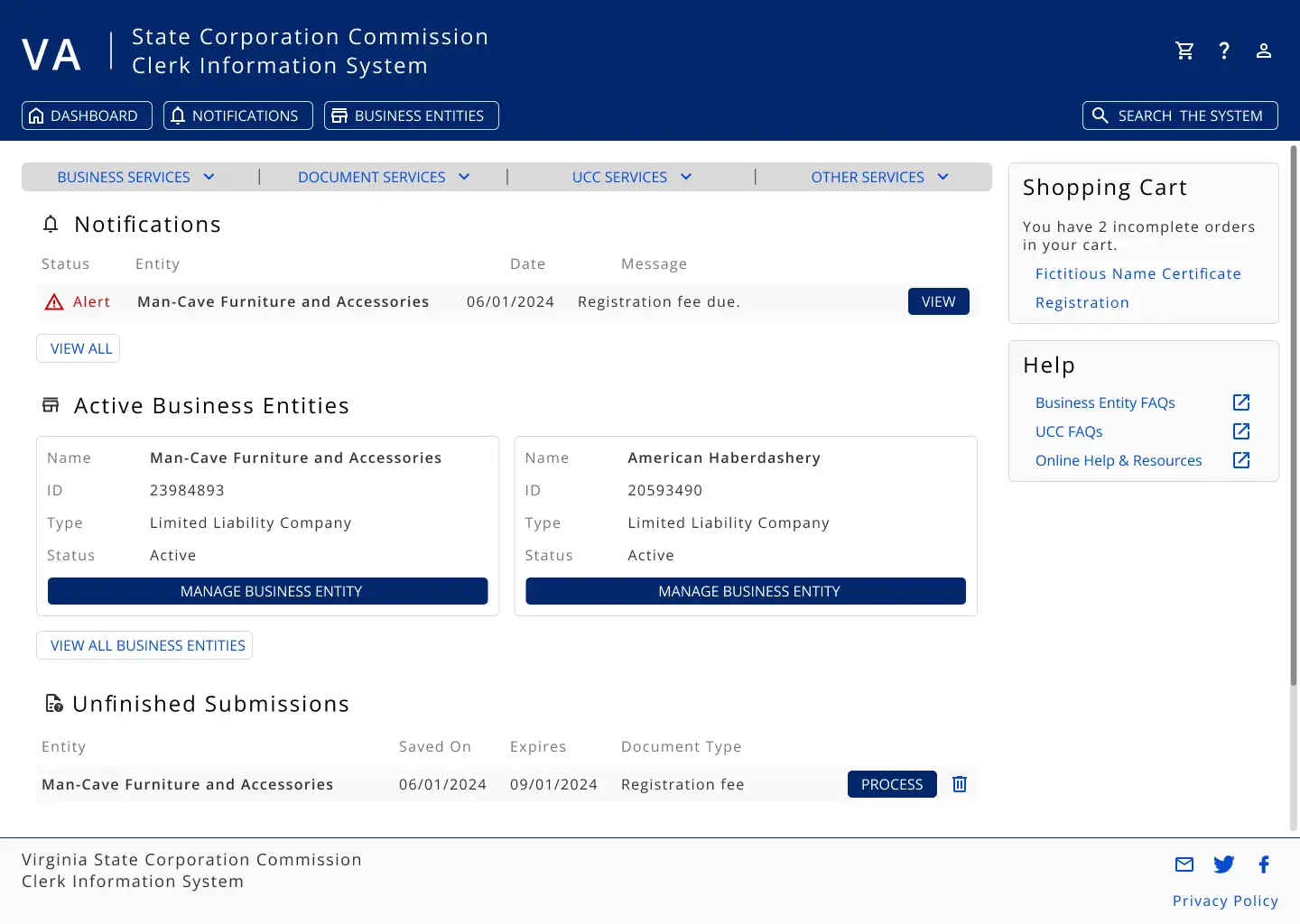
State Government Website

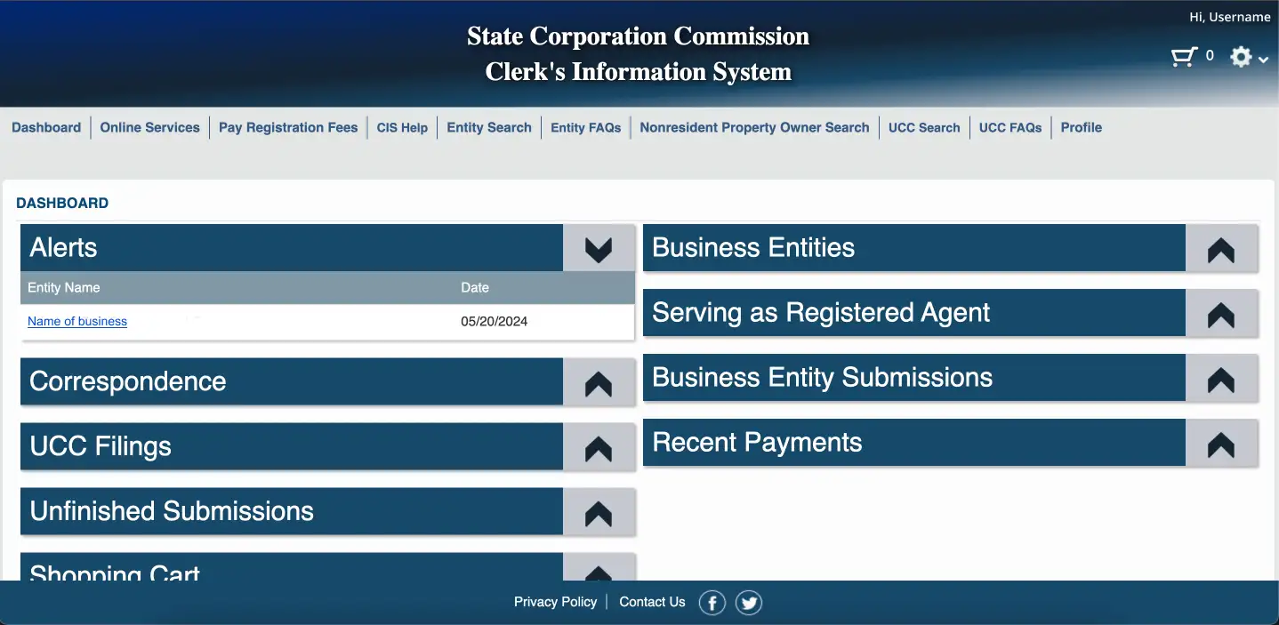
Anyone who has ever registered a business with the state of Virginia knows how confusing and frustrating the State Corporation Commission website can be. In this personal project, I tackled the Clerk Information System Dashboard and brought some order to the chaos.

Details
portfolio img 1

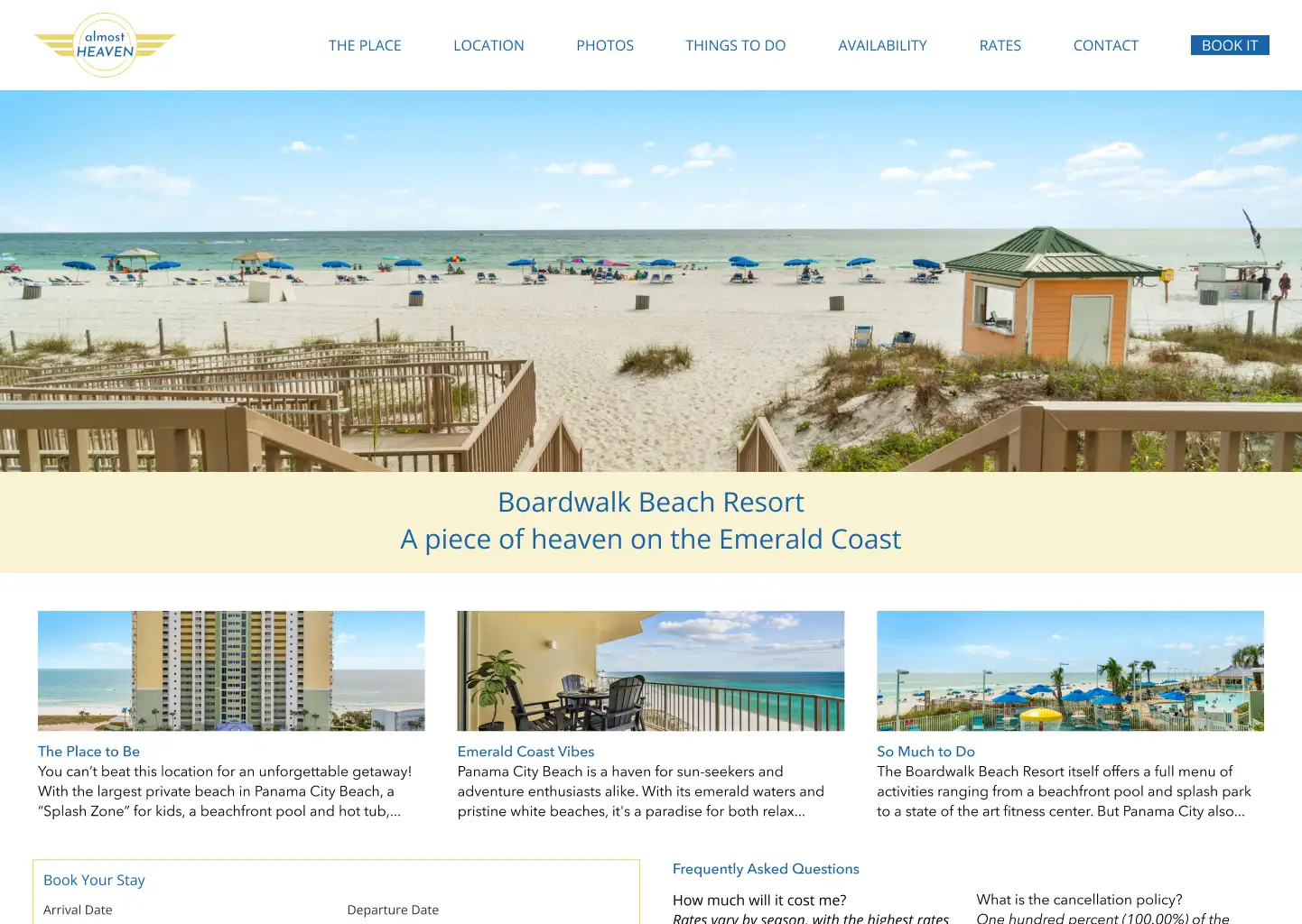
Small Business Website

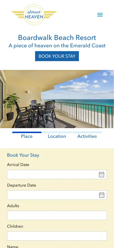
The owners of a beachfront rental wanted a better user experience for guests visiting their website. Keeping the limitations of their CMS in mind, I provided a design that is welcoming, informative, and easy to use.

Details
portfolio img 3

Marketing and Other

In addition to ux and ui design, I have served employers and clients in a variety of ways including marketing and branding design.

Details
Additional project examples available upon request.

UX Upgrade

Small Business Website

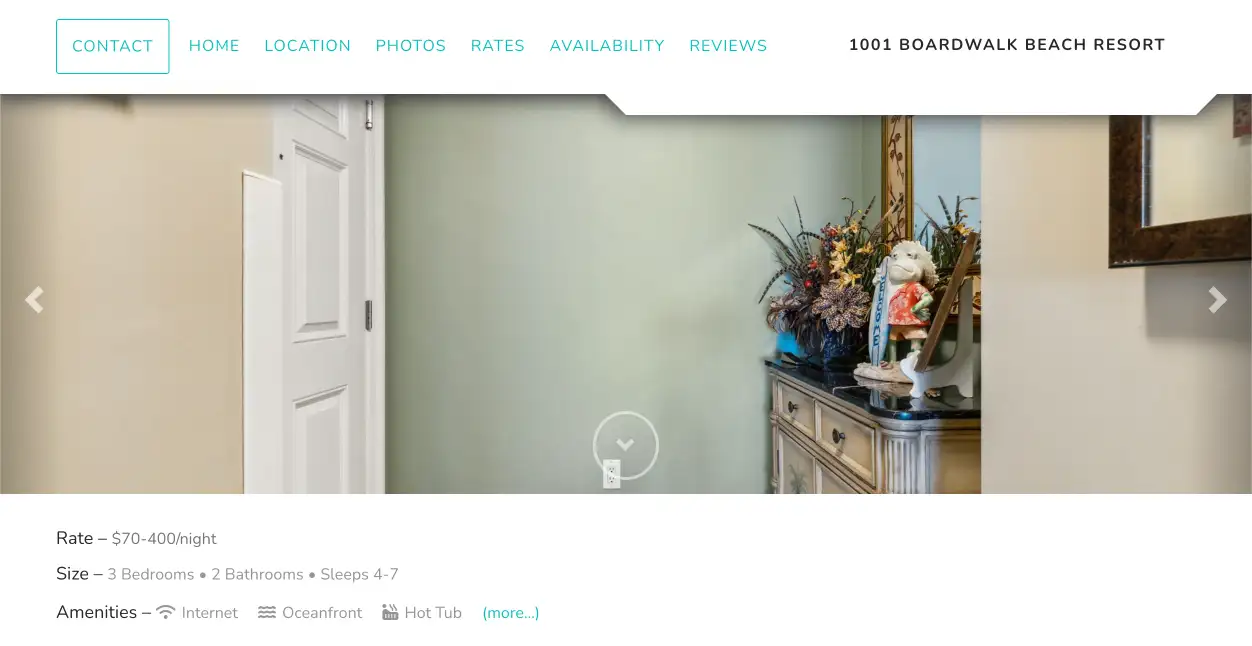
The owners of a beachfront rental wanted a better user experience for guests visiting their website. Keeping the limitations of their CMS in mind, I provided a design that is welcoming, informative, and easy to use. This project also included branding.

Problems this design update solved:
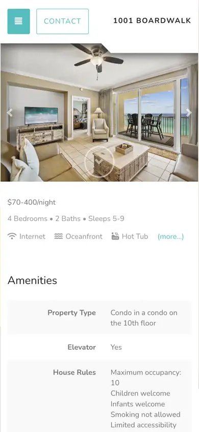
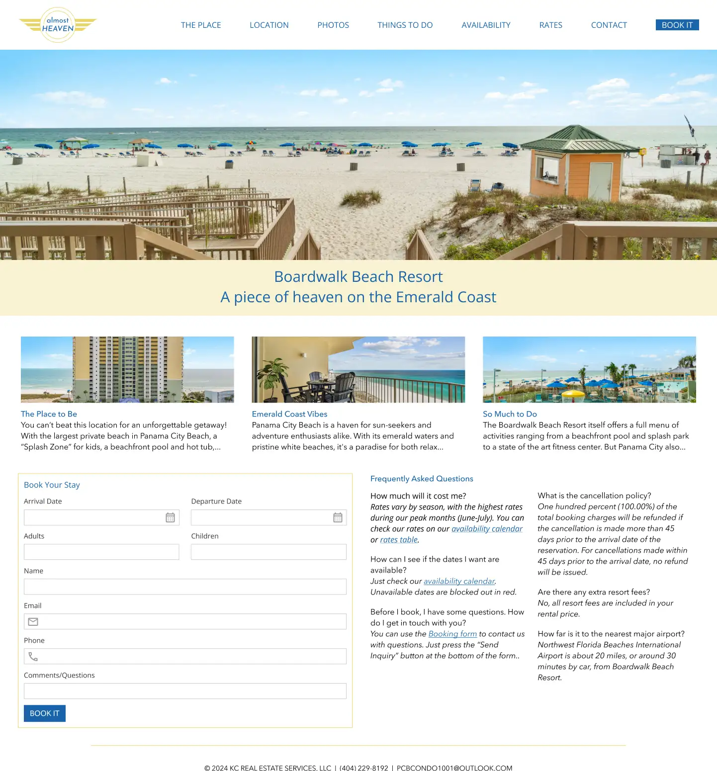
  • Branding: The site had no branding apart from the property address. The owners want to build a brand and expand their rental company with other properties. I worked with them to develop a brand and domain name and designed their logo.
  • Navigation: The low-contrast color of the navigation bar was difficult to read and failed accessibility standards. The navigation also exposed a few more problems with the site, one of which was the lack of a strong call to action. The call to book a stay was hidden under Contact, which led to a form that mixed general inqueries with booking in a way that was unclear. In addition to resolving the accessibility issue, I created a separate call to action for Booking with a bold button and also repeated the booking form on the homepage.
  • Homepage: The homepage itself felt more like a property description as the only content was a list of amenities. I moved this description to a separate page and created a homepage design that highlights reasons to book (like location and activities) and also brings the booking form to the forefront.
  • Content development: I also researched and wrote some new content, including a new page, Things to do, which suggests local attractions and entertainment venues for guests.
Mobile: Before & After
Desktop: Before & After

Dashboard Design

State Government Website

Anyone who has ever registered a business with the state of Virginia knows how confusing and frustrating the State Corporation Commission website can be. In this personal project, I tackled the Clerk Information System Dashboard and brought some order to the chaos.

Problems this design solved:

  • Header: The only way to know which state the site represents is to look up at the url. Virginia is never mentioned on the page. The addition of the state abbreviation in the site logo is minor but it helps identify the authority behind the page right away. I chose a more appropriate icon for the account button (formerly a "settings" icon) and moved "Profile" from the navigation to the account menu. I also added a help button to provide access to help and resources when users leave the dashboard.
  • Navigation: The "navigation" bar above the dashboard is a mix of things and not really representative of the site hierarchy; it is more a collection of links to relevant information and tools. I reduced it to actual navigational links and distributed the rest to more logical places. Help and FAQs moved to the header beside shopping cart, Profile to the account menu, and Online services became a toolbar at the top of the dashboard. These services are the main reason people come to the site, and this arrangement gives them more exposure and emphasis.
  • Dashboard content: A dashboard should give users a well-organized, curated view of important information and features. The current CIS dashboard hides everything in a disorganized list of accordion drawers. Nothing is available at a glance. I created widgets to display important content and tools, including services, notifications, the user's business entities, and a summary of orders currently in the user's shopping cart.

Note: I invested about 8 hours in this personal project and based these changes on personal experience with the CIS dashboard, heuristics, and standard ux principles. Much more research, thought, and collaboration would be needed to deliver a production-ready design.
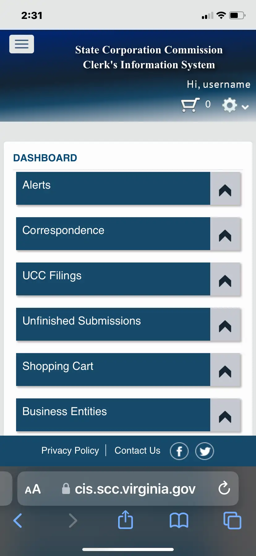
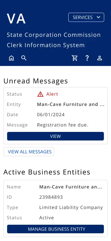
Mobile: Before & After
Desktop: Before & After

System and Strategy

Cloud Automation Platform

As head of design at Itential, I had the opportunity to guide the creation of a new design system and user interface for the company's emerging cloud automation platform. This project involved reimagining the customer experience and tailoring it to an array of different personas whose needs could vary widely depending on their role-based permissions. Our strategy had to accommodate both admins with access to everything and operators with very limited access.

This extensive effort began with the challenge to re-imagine how Itential's customers interact with the company's currently on-premise software. How could we make the experience in Itential's new cloud automation environment amazing? Goals that we identified included:

  • Simple to navigate and use
  • Quick to learn and master
  • Easy on the eyes

We came up with the idea of custom, role-based workspaces: based on a user's assigned permissions, the system would serve curated dashboards and navigation menus providing quick access to content and features. The current software delivered applications and assets in a silo fashion; the overall user experience was neither integrated nor intuitive. Our UX strategy for this cloud platform would produce a fully integrated, intuitive experience where the product adapted to the individual user.

Highlights of this project:

  • Design system: We designed +40 ui components and delivered the specifications via Figma to the engineering team, who built them on the Prime React library. In addition to designing some of these components myself, I reviewed and collaborated with the team on all of them.
  • UX strategy: Part of this effort involved developing our strategy both for the overall user experience in the cloud platform and for the initial product offering. With Product Management, we identified four personas representing the primary users of this new product. I assigned a persona to each designer on the team; in this way, as we collaborated on the different user stories, each persona would have an advocate. This was particularly helpful where user stories intersected among the personas.
  • Navigation: Our strategy for navigation involved a collapsible sidebar menu of relevant asset collections and other views that were available to the user. Any collection available on the workspace dashboard had to be accessible via the navigation sidebar as well.
  • Dashboard: The hub of every user's workspace is a dashboard view of widgets representing key content (asset collections, alerts, etc.) and features or tools required by that user to perform tasks. Included in this strategy was the ability of a user to customize the dashboard, choosing which widgets to show or hide and the order in which they should appear.

As the design manager and project lead, I facilitated collaboration with my team, product managers engineers, and other stakeholders, directed and supported the designers in their individual assignments, guided the development of the user experience we were creating. I also personally contributed along the way, devoting about 50% of my time to hands-on design work.

Dashboard and Navigation
Asset Collection View
Asset Detail View
Notifications panel

Marketing and Other Design

Products and Services

In addition to ux and ui design, I have served employers and clients in a variety of ways including marketing and branding design. These brochures represent a few of the pieces I designed for a former employer in the technology sector. I also had the opportunity in that position to help members of the sales and executive teams with presentation designs, which often included technical diagrams and other visuals. I enjoy the challenge of distilling complex technical information into a message that ordinary people can understand and appreciate.

Brochure
Brochure